Posts

Showing posts with the label R

Mitch gets upgraded - now with gene set networks

Image
Interpreting pathway enrichment analysis results is a big challenge. There may be hundreds of statistically significant pathways from an analysis and getting to a shortlist of key mechanisms to follow up with experiments and describe in a publication is difficult. I recently got a request from a collaborator to come up with a way to visualise the key networks. I groaned... because network analysis in bioinformatics is sometimes characterised by showing hairballs of hundreds/thousands of meaningless interactions. Mostly it is done poorly and the charts themselves do not have any explanatory function and mostly appear to be decorative. After seeing a few well done examples such as Figure 2 from Chappel et al (PMID: 32138627), I thought this could be something we include as a common step in the mitch workflow. For those of you unaware, mitch is the R/bioconductor package that Dr Antony Kaspi and I published in 2020 (PMID: 32600408) with the main focus being on multi-dimensional enrichmen...
Weird multi-threaded behaviour of R/Bioconductor under Docker

Image
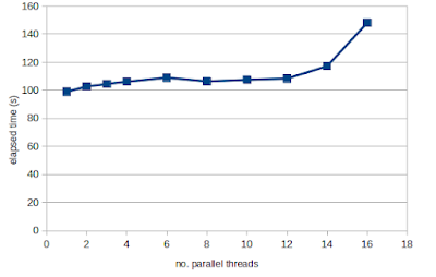
As I was running some R code under Docker code recently, I noticed that processes that should be single threaded, were using all available threads. And this behaviour was different between R on a native Linux machine as compared to Docker.  A search of the forums found that this is due to the configuraiton of the BLAS system dependancy on those Docker images, which is set to use all available threads for matrix operations. This configuration sounds like a good idea at first because dedicating more threads to a problem should speed up the execution. But realise that parallel processing incurs some overhead to coordinate the sub tasks and communicate the data to/from daughter threads. This means that you rarely achieve linear speedup the more threads you add. Typically what happens is that parallelisation has a sweetspot where the first 5-10 threads provide some speed-up, but beyond that there is either no improvement in speed or that adding additional threads actually makes the cod...

Installing R-4.0 on Ubuntu 18.04 painlessly

There are some great instructions here but there are a few gotchas to be aware of. Follow these instructions first, and it will make the process a LOT easier: 1. Make sure you have these dependancies installed. If you don't, you're going to have trouble installing any R packages like R curl, tidyverse, devtools, etc sudo apt install libssl-dev libcurl4-openssl-dev libxml2-dev 2. Remove any existing R install. sudo apt remove r-base* --purge 3. Remove any remaining packages. It's better to install them "fresh". They will be in locations like /home/user/R/R-3.6.6 and /usr/lib/R/library/ 4. Remove any existing entry for R in the etc/apt/sources.list to install an older R version. sudo nano /etc/apt/sources.list For example you might have something like this: deb https://cloud.r-project.org/bin/linux/ubuntu bionic-cran35/ 5. Then follow the DigitalOcean instructions here  and you should be set up in just a few minutes.

Upset plots as a replacement to Venn Diagram

Image
I previously posted about different ways to obtain Venn diagrams, but what if you have more than 4 lists to intersect? These plots become messy and not easy to read. One alternative which has become popular is the upset plot. There is an excellent summary of the philosophy behind this approach in this article  and academic paper here . An example plot is below: Example UpSet plot (Source: http://caleydo.org/tools/upset/) In this post, I'll describe how to get from lists of genes in text files and present it as an UpSet plot using R. As with most R packages, you'll find that loading in the data is the hardest part, and that data import is the least documented aspect. First I'll generate some random gene lists using a quick and dirty shell script. My complete list contains 58302 genes and looks like this: $ head -5 Homo_sapiens.GRCh38.90.gnames.txt ENSG00000000003_TSPAN6 ENSG00000000005_TNMD ENSG00000000419_DPM1 ENSG00000000457_SCYL3 ENSG0000000046...

How to generate a rank file from gene expression data in R

Previously I wrote about how to make a gene expression rankfile using the unix shell. While this works for me just fine, there are some differences in the behaviour of shell tools like awk an sed that make it unusable for mac users. Therefore, I think the best solution is to show you how to do this in R, which you can install on Linux, Mac and Windows systems. The expression data for this demo looks like this (the first 5 columns). Name                        logFC               logCPM            LR                PValue ENSG00000134294.9_SLC38A2   0.365464972841137   8.35504063447063  80.9697378748286  2.29200821312451e-19 ENSG00000164692.13_COL1A2   0.369440969815233   6.9371167845581   59.239238358843   1.39621819298599e-14 ENSG00000117152.9_RGS4      ...

Comparing expression profiles

Image
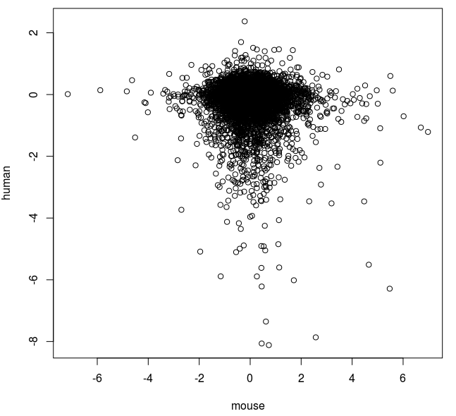
One of the most common tasks in gene expression analysis is to compare different profiling experiments. There are three main strategies: Compare all data points - using a correlation analysis Compare sets of up and down-regulated genes - using a binomial or Fisher exact test Compare sets of genes within a profile - such as GSEA test In this post, I'll describe how correlation analysis is used between expression data sets of all detected genes. Merging data sets No matter what type of correlation used, the profiling data sets need to be merged. This means selecting a field that can the datasets can be merged on. This could be a array probe ID, gene accession number or gene symbol as in this case. I will compare gene expression profiles from two experiments (azacitidine in human and mouse cells). The human gene profile was generated by RNA-seq and the mouse data set by microarray. The human data is currently in CSV format from Degust  and looks like this: gene,c,aza,F...

User friendly RNA-seq differential expression analysis with Degust

Image
There is a need to make bioinformatics tools more user friendly and accessible to a wider audience. We have seen that Galaxy , GEO2R ,  Genevestigator and GenePattern  have each developed a huge following in the molecular biology community, and this trend will continue with introduction of new RNA-seq analysis tools. Previously, I posted about differential gene expression analysis of RNA-seq performed by the DEB  online tool. In this post, I introduce Degust , an online app to analyse gene expression count data and determine which genes are differentially expressed. Degust was written by David R. Powell ( @d_r_powell ) and was Supported by Victorian Bioinformatics Consortium, Monash University and VLSCI's Life Sciences Computation Centre . In this test, I'll be using the azacitidine mRNA-seq data set that I have previously analysed.  To make the count matrix, I used featureCounts. First step in the process is to your RNA-seq count data. It can be done in tab ...

RNA-seq aligner accuracy tested with simulated reads

Image
In the previous post we looked at how choice of RNA-seq aligner influenced results. In this post, we'll use simulated reads to empirically determine the accuracy of OLego, STAR, SubJunc and SubRead. I made a pretty basic bash script (see below) to generate fasta format reads at uniform intervals along the length of transcripts without errors. The user can readily change the read length and the interval between read initiation. The script created 11.3 million 100 bp reads in 9 minutes so it is OK in terms of speed. It is designed to take Ensembl cDNA files as an input and has been tested on human  and  Arabidopsis . Here is what the generated reads look like >AT2G01210.1:gene:AT2G01210_197863 CGTCAGCTTTCGTTCTGGGGAAGAGCGGAATCGGAATTGTCTACAAAGTG >AT2G01210.1:gene:AT2G01210_197864 GTTCTAGAGAACGGGCTCACACTGGCCGTACGGAGATTGGGTGAAGGAGG >AT2G01210.1:gene:AT2G01210_197865 GTCTCAGAGATTCAAGGAGTTTCAGACAGAAGTTGAAGCCATAGGGAAAC >AT2G01210.1:gene:AT2G01210_197866 TAAAACAT...

Data analysis step 7: Fast MDS plot

Image
We will continue our  series  in the analysis of our azacitidine treated AML3 cell RNA-seq gene expression data set by generating a  multidimensional scaling plot . This is a potentially useful way of showing variability in datasets, especially when the number of samples is large. Trawling the blogs, I found a really quick and easy way to do this in R (thanks  Michael Dondrup@BioStars ) that can be used to analyse the count matrix. x<-scale(read.table("CountMatrix.xls", row.names=1, header=TRUE)) pdf("MDSplot.pdf")  plot(cmdscale(dist(t(x))), xlab="Coordinate 1", ylab="Coordinate 2", type = "n") ; text(cmdscale(dist(t(x))), labels=colnames(x), )  dev.off() Multidimensional scaling (MDS) plot for public gene expression data ( GSE55123 ).  The closer the labels are together, the more similar the samples are. So it is good to see that the untreated samples are clearly separated from the azacitidine treated samples. UNTR...

Data analysis step 6: Draw a heatmap from RNA-seq data using R

Image
In the last post of this series , I left you with a gene expression profile of the effect of azacitidine on AML3 cells. I decided to use the DESeq output for downstream analysis. If we want to draw a heatmap at this stage, we might struggle because the output provided by the DEB applet  does not send back the normalised count data for each sample. It is not really useful to plot all 5704 genes with FDR adjusted p-values <0.05 on the heatmap, so I will simply show the top 100 by p-value. Here are the general steps I will use in my R script below: Read the count matrix and DESeq table into R and merge into one table Sort based on p-value with most significant genes on top Select the columns containing gene name and raw counts Scale the data per row Select the top 100 genes by significance Generate the heatmap with mostly default values Google  searches  show that R has some quite elaborate heatmap options, especially with features from ggplot2 and RCol...