Beeswarm chart for categorical data
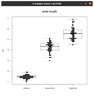
Biomedical journal articles are full of categorical data, showing data for control and case groups using barplots with whiskers. While these are popular, that type of chart can hide the underlying data patterns and are discouraged by statisticians. There are other alternatives such as boxplots, violin charts and strip charts, but I've become a big fan of beeswarm charts lately. The reason is that beeswarms show the distribution just like violin plots but have the benefit of showing the individual points, which is helpful if sample size varies between categories. The way I like to emply beeswarm charts is to first create a boxplot and then overlay the beeswarm. With that approach, the mean and interquartile ranges are shown, along with the actual datapoints. Here's the result. Some notes on how to make this chart: First step is to collect the data into a list of vectors, see the example code below for the iris dataset. Then make the boxplot. And finally the beeswarm plot with a...