Two dimensional filled contour plots in R
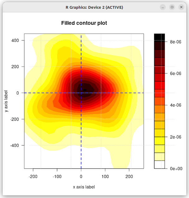
Also called kernel density plots, these are two-dimensional contour heatmaps which are useful to replace scatterplots when the number of datapoints is so large that it risks overplotting. I've used these sort of plots for many years, most notably in the mitch bioconductor package where it is used to map the relationship of differential expression between two contrasts. There are solutions in ggplot, but I thought I'd begin with a base R approach. In the example below, some random data is generated and plotted. Just subsitute your own data and give it a try. xvals <- rnorm(100,10,100) yvals <- rnorm(100,10,200) mx <- cbind(xvals,yvals) palette <- colorRampPalette(c("white", "yellow", "orange", "red", "darkred", "black")) k <- MASS::kde2d(mx[,1], mx[,2]) X_AXIS = "x axis label" Y_AXIS = "y axis label" ...